Monday, 12 October 2015

Fast Food in Hospitals: The Guardian

http://www.theguardian.com/society/2015/oct/10/sugary-snacks-hospital-vending-macines


And issue that lends itself to our argument is thew one concerning the growing obesity in England. Vending machines are a source of snacks and binge foods, but little did we know the impact that they are having in hospitals. The fact that a public area allows its people to eat fast food and drink fizzy drinks is beyond shocking. the importance of keeping a healthy lifestyle should be kept up in places nurturing for the ill; not helping them towards it.
Health regulators Nice advice that no more than 20% of vending machine drinks should be sugar sweetened, and that sweetened drinks should be no more than 330ml. However, Nottingham Hospital offers over 19 different types of fizzy drink, or juice drinks and two milkshake alternatives.

Another source, Jebb, announces its concerns over the meals being served in the hospitals, too. Fast food chains such as McDonald's and Burger King can be seen on some hospital premises. To me, this is a bizarre twist in the article. How can hospitals, who pride themselves in the health of their patients, let the family and friends eat themselves into the hospital beds next to them?

The article brings up once again the issues of obesity in younger children 'Nearly one in five secondary schools is obese, as are a quarter of adults, NHS England estimates. Type 2 Diabetes, often associated with obesity, costs the NHS some £9bn a year, says Diabetes UK'  This issue will surely continue to inhibit the NHS's battle with obesity and other related obesity risks, but until it solves the problems within it's own walls, how can it point the finger at other companies for selling us the sugary intakes that can kill us, when their vending machines are causing half the problem?

Relating back to our coursework piece, this article is an insight into not only the problems people are having with sugary intake, but coupled with the disinterest to play sport can be a critical factor on a young adult's well being.


Fonts on Premier and Da-Font experimentation


Font used: Eras Light ITC
Software: Premier Pro

We framed this to the

 The font above is similar in layout to the film Denali we viewed earlier in the year. Although the words are not as broad the concept of having the audience focused on the words with no sound is the same. With our film we plan to have a slow hum, almost mechanical, to allow the weight of the facts being shown to 


Font used: Eras Light ITC
Software: Premier Pro


Wednesday, 7 October 2015

Fonts and layouts


These are the styles of fonts I am aiming to achieve in Premier. It combines the serious tone of the film and the sleek professional look we are after. The spectators' eyes will be drawn to the interesting font and will be more likely to engage with the material. What I have noticed is that the information is minimal and catchy to keep the spectator interested. In our short film we will have to make the facts and figures more interesting by having them captivate the audience. The cinematic experience combined with the professional fonts will enhance the viewers experience and make them more likely to share through Facebook and on YouTube.  


 The use of font in this collage mixes the vast impression of the 'Junk' and the sleek look of the 'Subtle headlines'. This would be interesting to experiment with to 


Monday, 28 September 2015

Let's beat cancer sooner - Cancer Research UK


This is a longer advert but done by the same company. The group that made this has focused on using a recognisable soundtrack and a series of motivational images to continue the hype of the message; we can beat Cancer. The use of fonts in this video uses bold lettering to highlight important information such as '1 in 4'. These promising results are reminiscing of the previous analysis of the previous advert, but the emphasis on this video stems from scientists. This alludes to the idea that the important subjects in this advert are being stimulated by the average person.
'The Tables are beginning to turn' enforces the message of the music becoming upbeat. The constant movement in the camera allows there to be some energy about the performances while the piano creates more gravitas. The video also uses a mixture of races and gender to get across the point that nobody is immune from Cancer and it is a world wide problem that affects us all, Whether it be somebody we know or a family member.

To conclude, this video achieves its intended ending; to raise hope for the spectator that we will beat cancer. With the other adverts the message is the same but with this advert the message is stronger becuase of the kinetic energy captured in the film.

Let's beat cancer sooner-Yotube analysis


With this advertisement the company have changed their advertisement strategy dramatically. In previous versions they had  used the marketing on loss and grief, hoping people would be able to empathise with others and donate. This was mainly because of the odds being low for survival, but in this advert the odds are revealed to be of great hope. Half as many people that die from cancer live from cancer, due to the overwhelming support of people around the nation.

This advertisement does well because it has constant movement, a steady flow of facts and figures and a driving soundtrack help keep the shots flowing. Without these concepts the advert would have been static, whereas the director plays on the energy of the upcoming results. the hope for a better future will inspire people to continue to get involved, which is of a similar message we want to pass onto our audience.

The key themes of this advert is that everyone is standing together, no one is apart after the music increases in energy. This imagery is important for the reveal of the statistics, conveying the message that our hard work had lead to the improvement of peoples lives all over the globe.


Friday, 25 September 2015

2014 National USA team kit: equality


As previously mentioned in a past post, the USA national team was the only country to have women and men in the reveal of their new kit for 2014. Due to the success of the female football team over the last decade the faces on the poster are not so foreign to the football fanatic, but are still unknown to the common household.

What is unusual about this photo-shoot is that instead of glamorising the sport with athletes the photographer has decided to have an equal balance or gender and race. The varying age levels as well not only show how the kit looks on each individual; but what it represents to them. Because of the mix of gender as well the company are expanding their target audience.

What is promising about this shoot is that both the female and male football teams are included. There is no longer a divide in the sports but the 'England team' is seen as a unity rather than 'A man and a women's sport'

The framing allows the models to be of equal power. Their unity in thier uniform and thiier stance conveys thier confidance. What I like the most is the fact that everyone is of a different race or gender in the frame. the younger induvisuals level out the shot are kneeling or standing. the older athletes are frameing the background of the stadium with the outskirts of the ring.


Female athletes representation in sport


These images portray the marketing stratages for the company Nike. Serena Williams is a world renound sports superstar. She has conquered her sport and regularly attains 'Serena Grand slams' in which she wins all four opens (American, British, Australia and France). The image above is a powerful message that many women can relate to 'Age is just a number' is a common saying amongst people, but the gap in the spacing allows for the impact of 'Serena is #1' to power through. This method of marketing plays on the importance of self esteem and it's ability to empower those who follow it.


This was a shot I didn't particularly like. I didn't like the combination of the sparkle and sport. Although William's is wearing what would be considered normal attire for tennis, the orange is too garish for me and too over the top. Her position is strong in the frame and her face is full of determination, but I feel the message is lost through this modelling tactic.


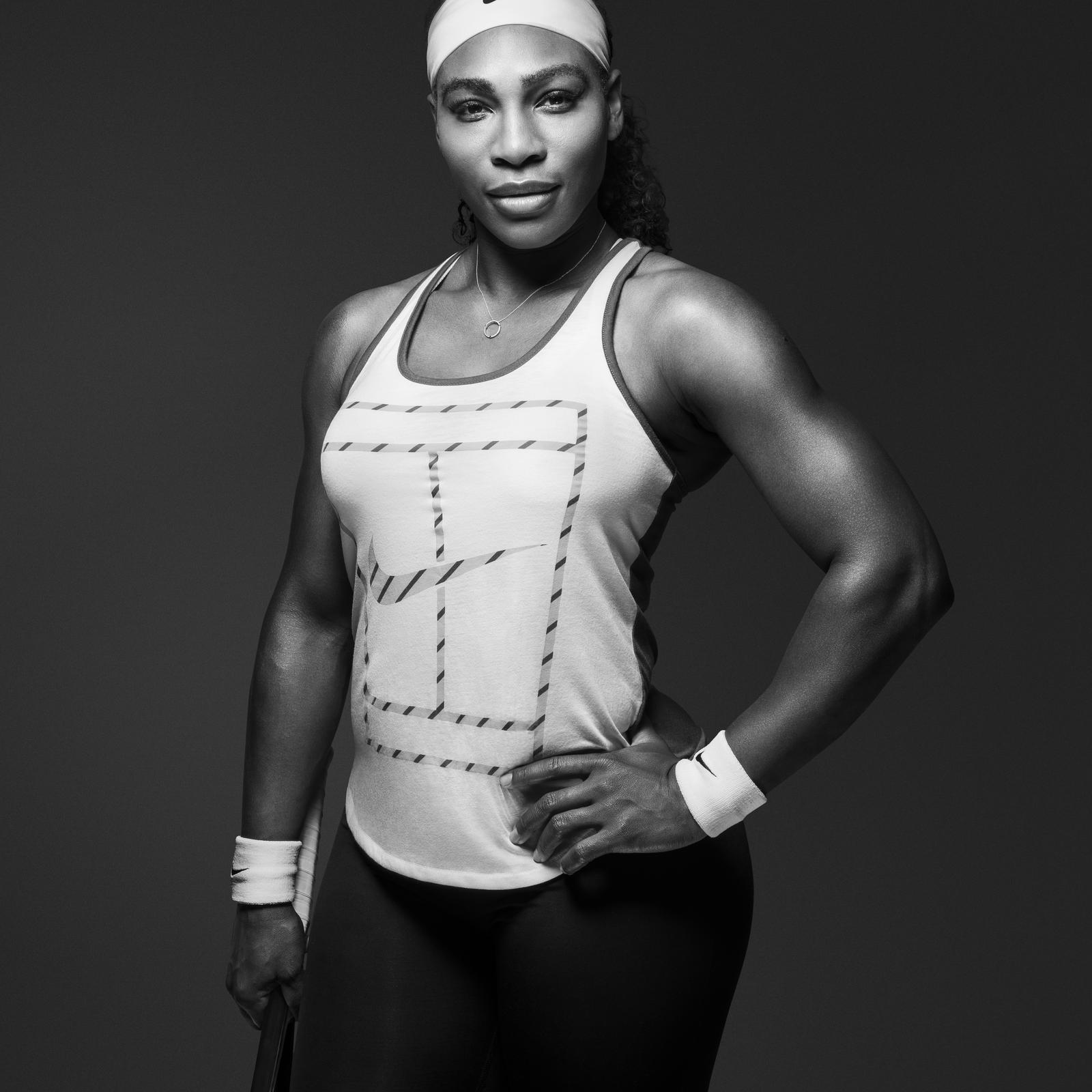
What I like about this photo is that Selena is showing off her arms. Williams has had comments on before by the press as being too 'manly' and 'too muscular' for magazines. Her strong stance pairs with the confidant look she is giving the camera. What I like is that the shot is very basic but the photographer uses the high contrast o the black and white and the stance to specific detail, adding more to the image.