Monday, 28 September 2015
Let's beat cancer sooner - Cancer Research UK
This is a longer advert but done by the same company. The group that made this has focused on using a recognisable soundtrack and a series of motivational images to continue the hype of the message; we can beat Cancer. The use of fonts in this video uses bold lettering to highlight important information such as '1 in 4'. These promising results are reminiscing of the previous analysis of the previous advert, but the emphasis on this video stems from scientists. This alludes to the idea that the important subjects in this advert are being stimulated by the average person.
'The Tables are beginning to turn' enforces the message of the music becoming upbeat. The constant movement in the camera allows there to be some energy about the performances while the piano creates more gravitas. The video also uses a mixture of races and gender to get across the point that nobody is immune from Cancer and it is a world wide problem that affects us all, Whether it be somebody we know or a family member.
To conclude, this video achieves its intended ending; to raise hope for the spectator that we will beat cancer. With the other adverts the message is the same but with this advert the message is stronger becuase of the kinetic energy captured in the film.

Let's beat cancer sooner-Yotube analysis
With this advertisement the company have changed their advertisement strategy dramatically. In previous versions they had used the marketing on loss and grief, hoping people would be able to empathise with others and donate. This was mainly because of the odds being low for survival, but in this advert the odds are revealed to be of great hope. Half as many people that die from cancer live from cancer, due to the overwhelming support of people around the nation.
This advertisement does well because it has constant movement, a steady flow of facts and figures and a driving soundtrack help keep the shots flowing. Without these concepts the advert would have been static, whereas the director plays on the energy of the upcoming results. the hope for a better future will inspire people to continue to get involved, which is of a similar message we want to pass onto our audience.
The key themes of this advert is that everyone is standing together, no one is apart after the music increases in energy. This imagery is important for the reveal of the statistics, conveying the message that our hard work had lead to the improvement of peoples lives all over the globe.
Friday, 25 September 2015
2014 National USA team kit: equality

As previously mentioned in a past post, the USA national team was the only country to have women and men in the reveal of their new kit for 2014. Due to the success of the female football team over the last decade the faces on the poster are not so foreign to the football fanatic, but are still unknown to the common household.
What is unusual about this photo-shoot is that instead of glamorising the sport with athletes the photographer has decided to have an equal balance or gender and race. The varying age levels as well not only show how the kit looks on each individual; but what it represents to them. Because of the mix of gender as well the company are expanding their target audience.
What is promising about this shoot is that both the female and male football teams are included. There is no longer a divide in the sports but the 'England team' is seen as a unity rather than 'A man and a women's sport'
The framing allows the models to be of equal power. Their unity in thier uniform and thiier stance conveys thier confidance. What I like the most is the fact that everyone is of a different race or gender in the frame. the younger induvisuals level out the shot are kneeling or standing. the older athletes are frameing the background of the stadium with the outskirts of the ring.
Female athletes representation in sport

These images portray the marketing stratages for the company Nike. Serena Williams is a world renound sports superstar. She has conquered her sport and regularly attains 'Serena Grand slams' in which she wins all four opens (American, British, Australia and France). The image above is a powerful message that many women can relate to 'Age is just a number' is a common saying amongst people, but the gap in the spacing allows for the impact of 'Serena is #1' to power through. This method of marketing plays on the importance of self esteem and it's ability to empower those who follow it.

This was a shot I didn't particularly like. I didn't like the combination of the sparkle and sport. Although William's is wearing what would be considered normal attire for tennis, the orange is too garish for me and too over the top. Her position is strong in the frame and her face is full of determination, but I feel the message is lost through this modelling tactic.
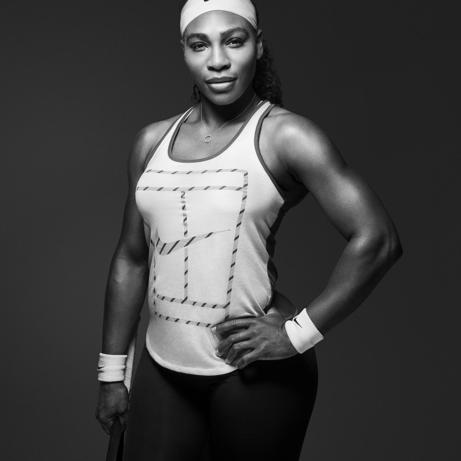
What I like about this photo is that Selena is showing off her arms. Williams has had comments on before by the press as being too 'manly' and 'too muscular' for magazines. Her strong stance pairs with the confidant look she is giving the camera. What I like is that the shot is very basic but the photographer uses the high contrast o the black and white and the stance to specific detail, adding more to the image.
Photoshoot for sports
In this post I will be looking at how photo-shoots are framed for each particular sport and whether I believe it to be a positive or negative representation. Women can be framed in many representations but it is the media that a bias as to how we perceive particular sports as male or female dominated. For example, when the 2014 football kits were revealed, only one country out of the thirty two teams who qualified for the world cup featured female athletes on their posters. The USA proudly show a mixture of gender and races, compared to the other male dominated posts.

The football player in this shot is using energy from her movement to power through the screen. The photographers decision to frame her to the rights adds to her body movement as she passes the cone. The use of dark colours combined with a singular bright cone is effective in attracting the eye to the centre of frame.


I like this shot I found on the internet of the young woman running. I find the framing displays the desert well around her and allows for a greater impact on the spectacle. I also like the use of red against the barren background, this is similar to the effect we want to use in our short film, combating the barren surfaces with the young female athletes who are training hard. I am investigating what
colours will look good with what background such as reds with browns and blues with green.
The netball photo displays two athletes in the middle of a game. They are framed in the middle of the shot elongating their features as one rises for the ball. Both are in strong stances and are given definition by the black background of screaming fans.
 The girl warming up here is levelling out the shot with her leg by angling it in co-ordination with the railings. the atmospheric background allows connotations of aspiration to blend with the cool colours. Her trainers are once again the stand out colour in this shot, allowing the Nike logo to stand out as a marketing brand. However her overall stance balances this subtle marketing strategy out allowing the viewer to take in the picture beforehand.

The black and white image shown (Bottom Right) draws on similar aspects from the Serena William's photo in a previous blog. Her full ability is in show as it captures her during a performance, the minimal clothing has a similar effect to William's in which it lets us focus on the details of her performance.
The football player in this shot is using energy from her movement to power through the screen. The photographers decision to frame her to the rights adds to her body movement as she passes the cone. The use of dark colours combined with a singular bright cone is effective in attracting the eye to the centre of frame.
I like this shot I found on the internet of the young woman running. I find the framing displays the desert well around her and allows for a greater impact on the spectacle. I also like the use of red against the barren background, this is similar to the effect we want to use in our short film, combating the barren surfaces with the young female athletes who are training hard. I am investigating what
colours will look good with what background such as reds with browns and blues with green.
The netball photo displays two athletes in the middle of a game. They are framed in the middle of the shot elongating their features as one rises for the ball. Both are in strong stances and are given definition by the black background of screaming fans.
The black and white image shown (Bottom Right) draws on similar aspects from the Serena William's photo in a previous blog. Her full ability is in show as it captures her during a performance, the minimal clothing has a similar effect to William's in which it lets us focus on the details of her performance.
Shots/Tone for the film

I really like this colour palette for this shot. the foreground colours are dull and earthy, which the background being a riveting blue colour. I like this use of colour because I want the oppression of the facts and figure to seem to affect the woman, thus them wearing earthy or dark colours. However we juxtapose this with a deep colored football pitch or a dance floor.

This is a god example of how we can create an atmosphere in our film, using silhouettes and overbearing light in the shot. I have recognised the lighter side of the spectrum has shades of grey and light pinks, unlike the one above which has darker tones of blue. This creatues an urbun feel to the image, as well as coupling the frame with the strong degree of thirds.
Within this shot the green is used to enhance the depth of this shot. With the two actors placed in the rule of thirds, the two character's frame themselves and the action. By entining the green and the browns together it allows the navy colours to mix the combination of colours together. This is a fantastic way of mixing the colours together and bringing the enviroment to live. It has become aware to me that bringing the location shot is key in increasing the kinetic energy because the emotion is continued through the sequence.

This is a fantastic shot that captures my idea. I visualise the grounds or the playing surfaces that the girls are on to be big and magnetic, whereas the people look small in comparison (Expect for in the close ups displaying their determination). The secondary colours that pair with this are a mixture of blues and greyish pinks. The idea is that the empahsis on colour will make the cinematic viewing more pleasing to the spectator making is a visual to the eyes. Coupled with extreme long shots and close ups this will have an atompshere that will immerse the audience into this perception of a different world.

I have determined after analysing this spectrum that our Colour palate should have one focus colour, such as a deep blue or green. This allows the attraction of the shot to be placed firmly on the sport of playing field. The next colours in shot will be greys and pinks allowing the colours to mix in with one another. These colours will be the cloudy sky or the surrounding area. The next colours that mix in
will be the athletes themselves. Similar to the third shot, they will have dark primary colours that will define them from the background.
Tuesday, 22 September 2015
Feedback
Feedback and Task
- Research on documentaries or public service videos
- Film form-Decide what form we want to take on
- One minute of footage/Images to create a visual image
After discussing within our group, Tori, Lucie and I decided to make our short film a pubic service video. This was because we wanted to inspire others rather than feed them information.
Possible shot ideas for our Short Film-Concept Ideas
- I had the idea of using a dark room such as the Drama Room to do some atmospheric shots. This would involve shots of dancing and football. When the camera tracks or someone runs past with a football the athlete will down in slow motion. As they do so the text will appear on-screen detailing the depressing facts and figures about girls playing sports: 'Britain's teenage girls are rated the third obese in the world (Sport England 2013)' and 'In a survey, many girls revealed they were too shy or body conscious to pursue their dream sport'
This can be followed by a girl lowering her head down to the floor as she sits on the side line. The other girls involved within the film begin to move into position. The catchphrase 'But we want to change that' will appear and a football will be kicked through the figures.
- The music will suddenly rise up and become motivational. Various girls (12-18) will be seen doing activities and moving to the beat. I hope to include a graphic match within this sequence to convey the diverse range in sports women can play. The subtitles 'As of 2015, Sport England are injecting £1.5 million into schools for girls sport' This is followed by more sequences and titles interacting with the shots.
- The message we want to give is that 'Sport is increasing and their are now clubs out there for girls; But we need to just keep going'. This can be done as part of a voice over 'Just keep going' as a runner begins to slow down her jog. The rest of the girls will slow down also (Either making decisions within their scene or having a moment of reflection). The music has a buzzing feel to it, like a speaker waiting to be plugged in. As soon as the runner girl begins again the music retains its energy and play resumes.
Other facts that can be used in the film:
'Sports help increase integrity, courage and confidence' These words will be big and bold, allowing the spectator to realise how important sport is to young girls.
'98% of girls who plays sports go onto attend higher education or a managerial job'-Cut with this to show a girl captain ordering her team to move forward'
This was a fantastic result following the increase in sport of the last five years. This will further encourage the spectator to get involved in sport because of its link to higher education.
Fonts
The fonts will have a metallic feel, giving the facts more premise within the frame. This means there will be a greater impact once the girls begin to knock down and defy the subtitles.
Subscribe to:
Posts (Atom)