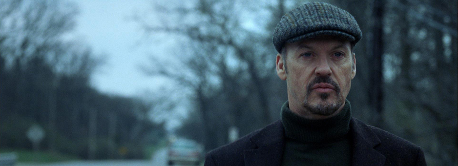
Within my film I intend to learn more about colour grading and how to make my audience feel a particular mood within my film. Becuase the opening is restaining my character from her goals, I want the opening shots to convey be desaturated and monochrome. This will help sell to the audience that my protagonist is down on her luck or there is an obsticle against her.

These wide isolationg shots are perfect demonstation for the feel I am going for at the begining of the short film. Although there is more depth of field in these shots, they are to show how far away the subject is from were they want to be. Photo One makes the spectator want to understand what the character is staring at, while Photo Two allows us to see what this character is looking at. But combind with the blue colour correction and body of water is allows the spectator to feel the distance between the place that character wants to be.
As the film progresses, however, I will open up the colour within the film and let the greens of the feild and the pinks of the kit shine through. After seeing the pormotional videos 'Pressure Makes Us' I was able to see how having strogn colours can convey positive emotion.
No comments:
Post a Comment